• Blog
  • Design Portfolio
  • Contact
Menu

5 things I learned today

  • Blog
  • Design Portfolio
  • Contact
×

OMG Space - Gorgeous Art Infographics of Space Objects by Margot Trudell

Ryan Nance February 8, 2018

This truly phenomenal project is from Margot Trudell, a graphic, web and motion designer living and working in Toronto, Canada. They are available as art prints or stretched canvas here. I am definitely wanting to get some for the kids' study.

From her project page:


OMG SPACE

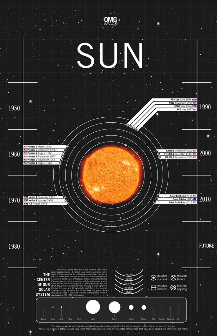
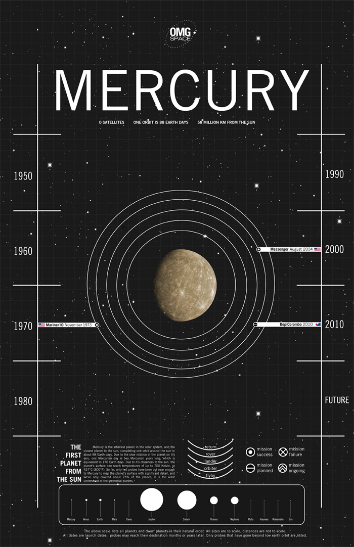
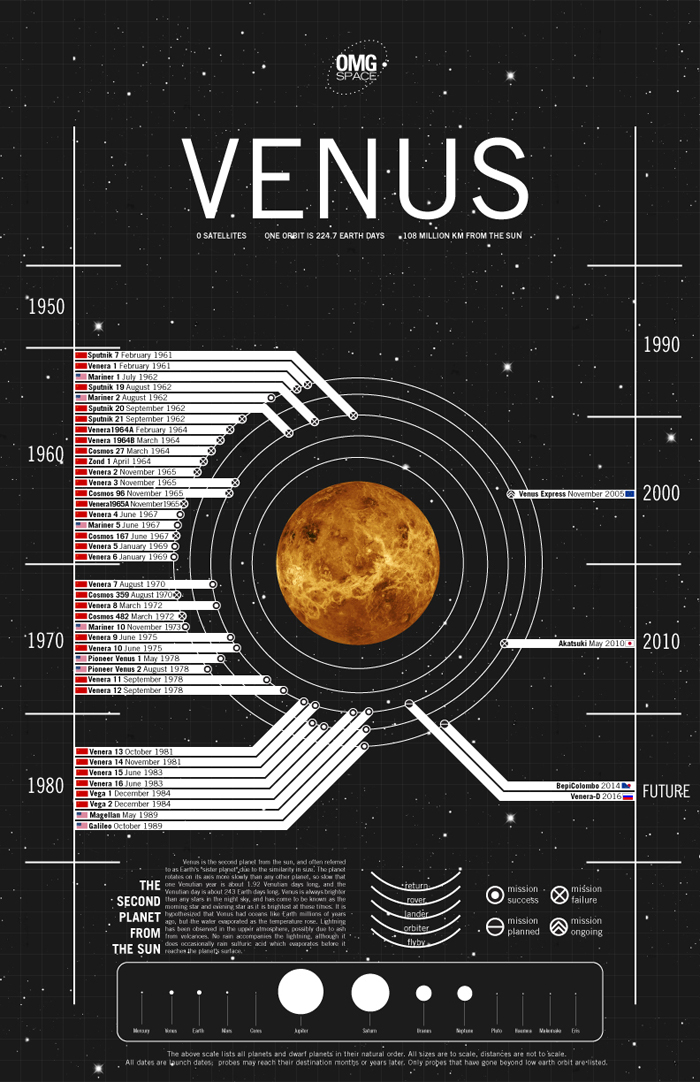
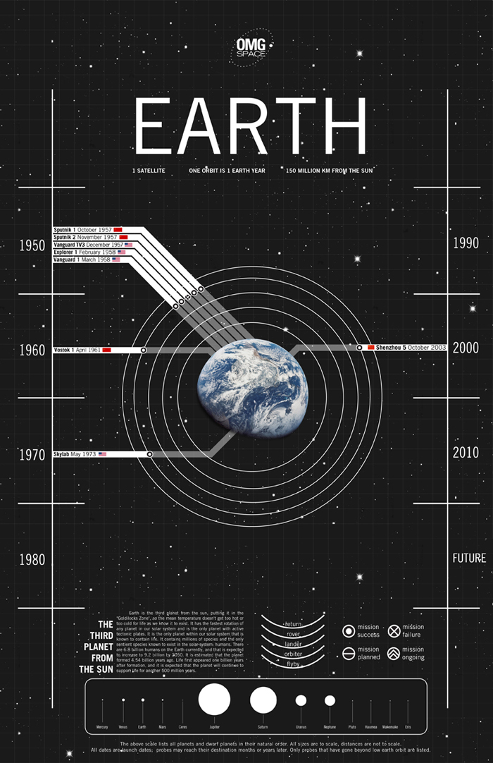
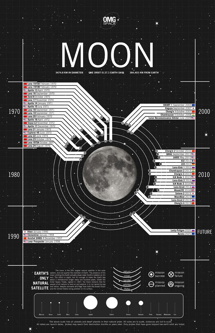
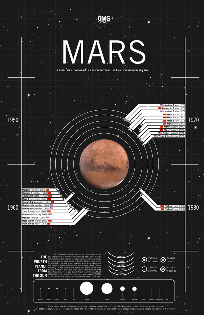
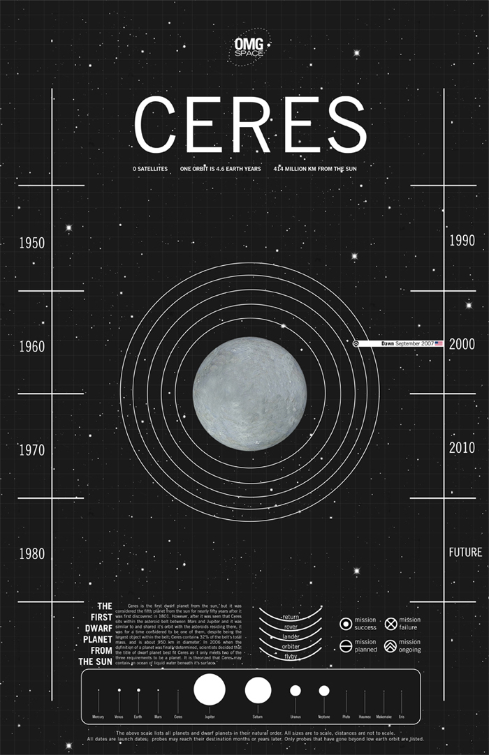
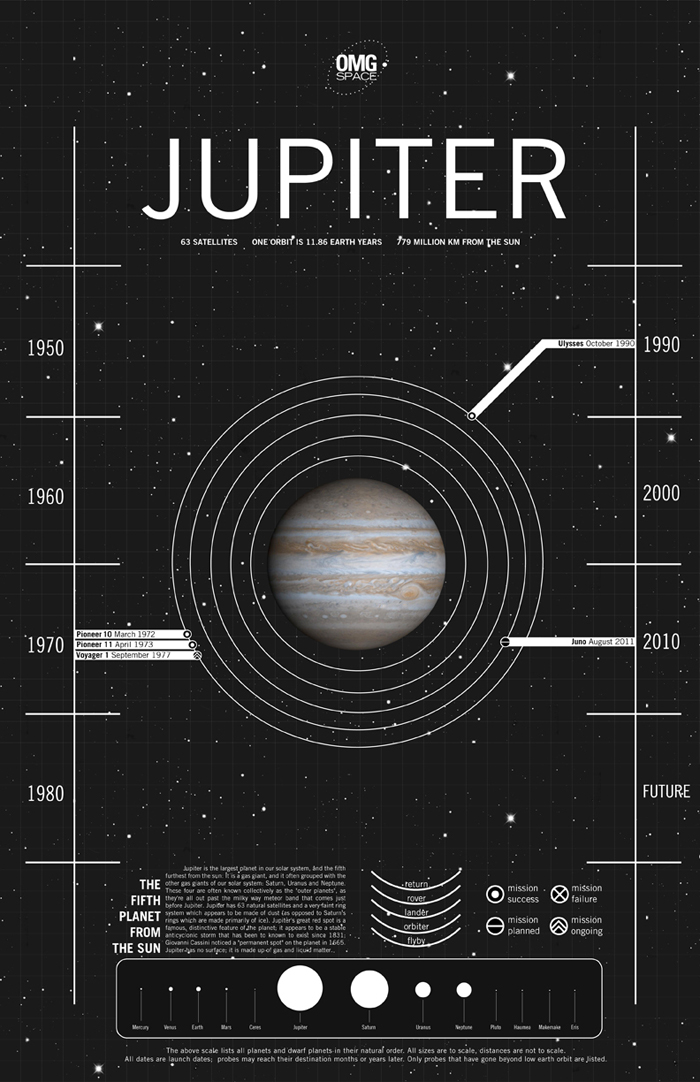
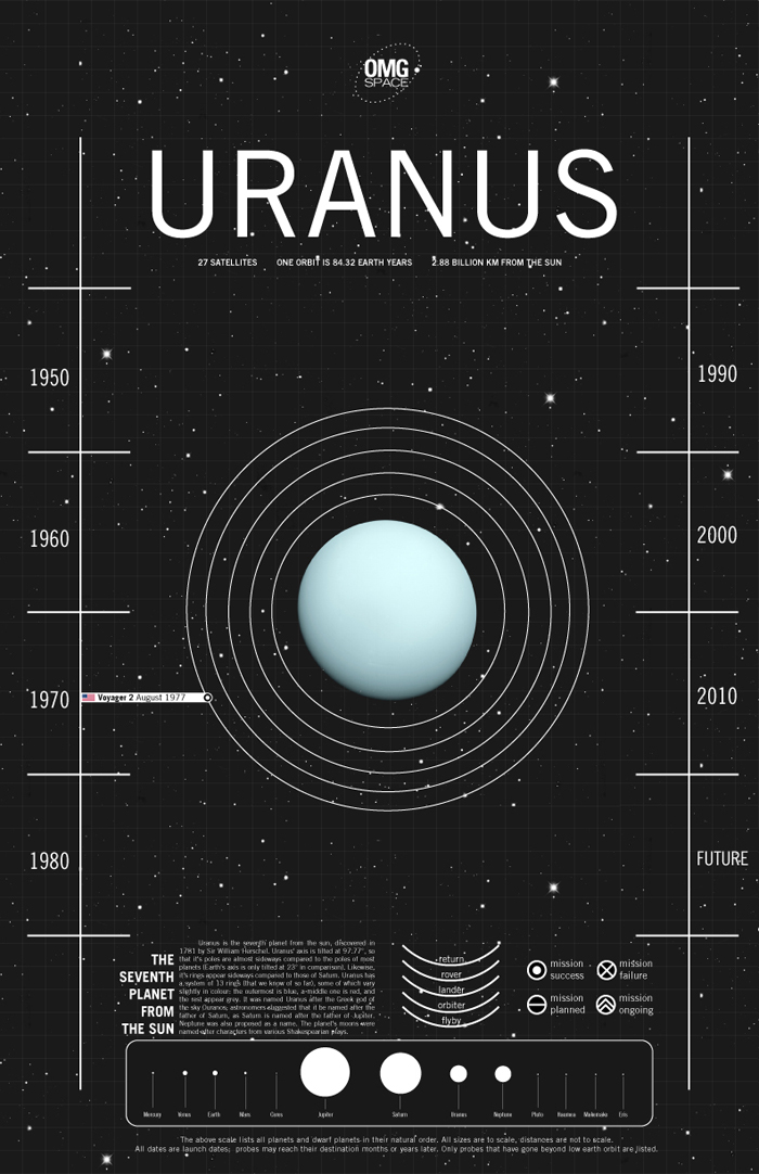
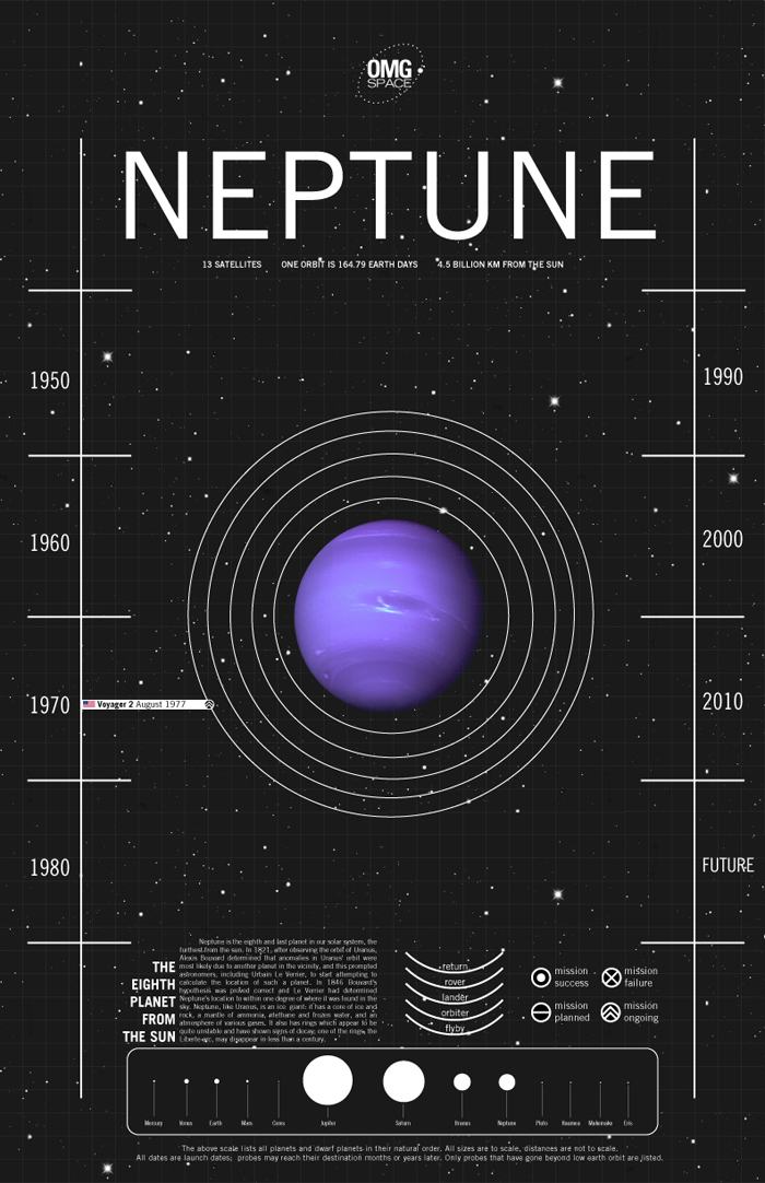
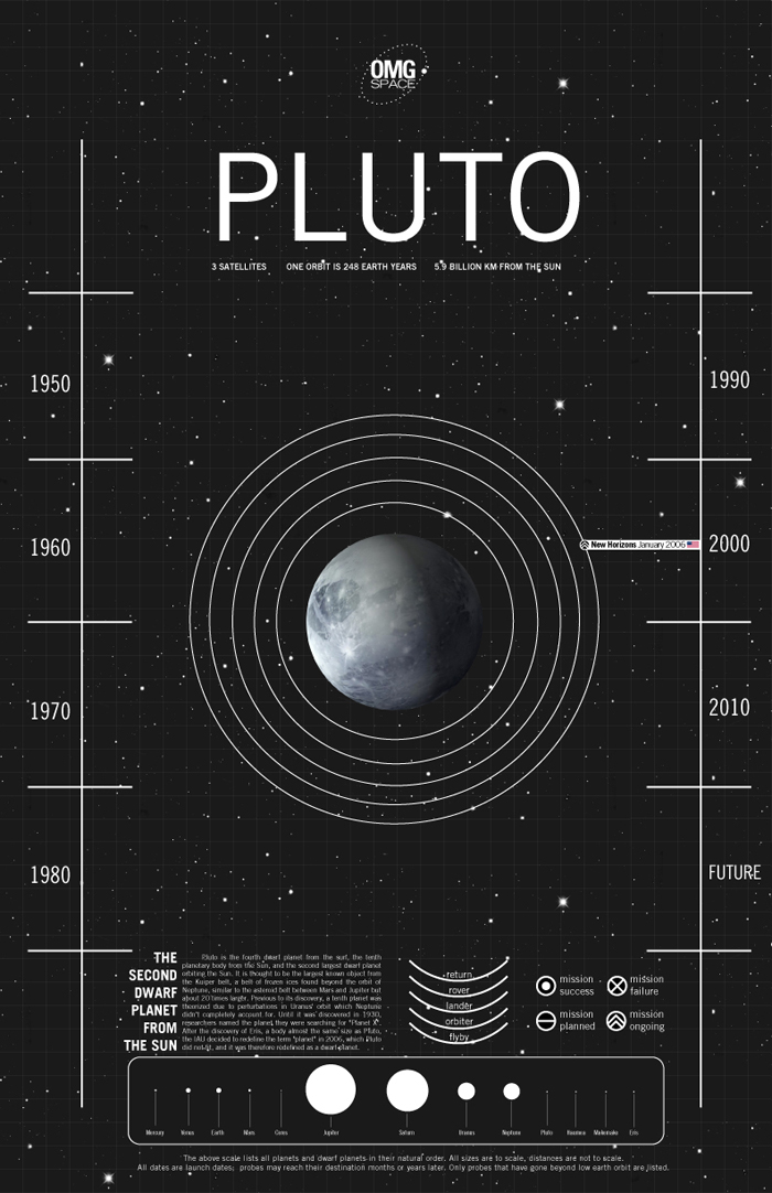
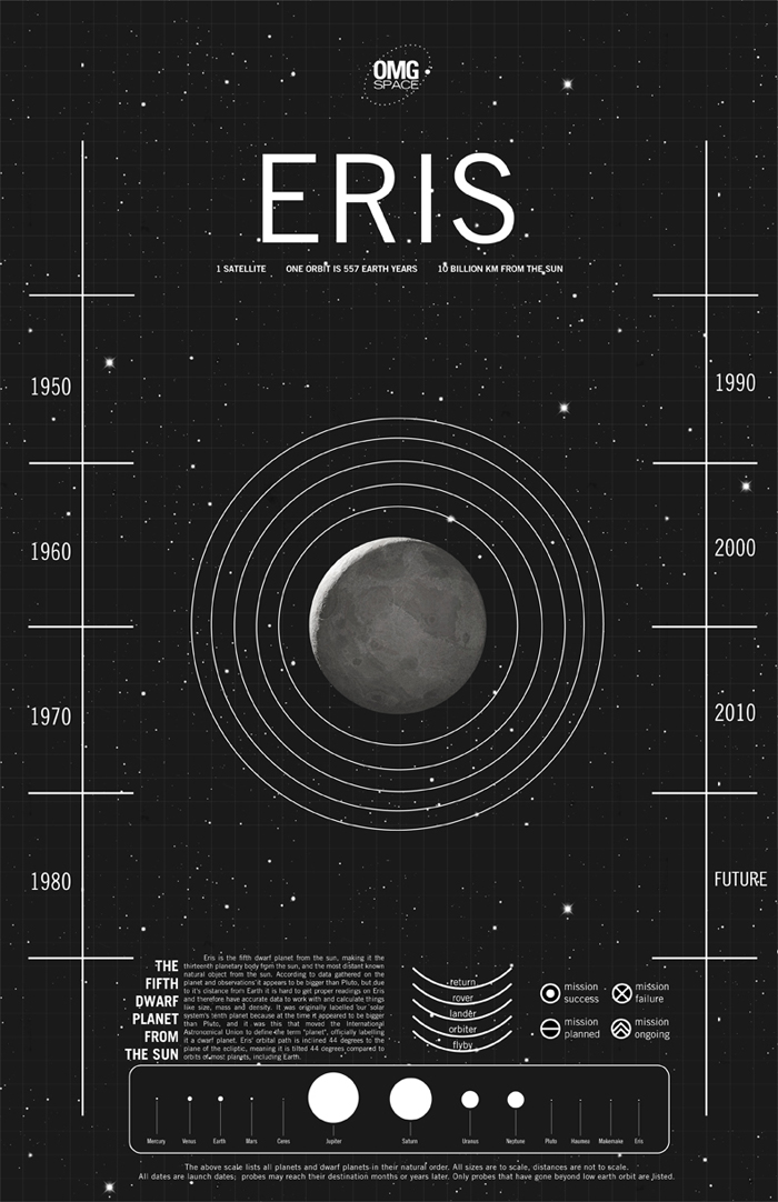
With this project I wanted to communicate to people what we've managed to accomplish in space exploration in simple terms; I found that many people don't know much about the subject because of how it's typically communicated, with scientific and technical jargon. Through the use of infographics that simply and clearly illustrated a lot of information, people could easily take a brief look at one infographic and even without looking closer grasp that we've managed to send a lot of things and people to the moon for example, and looking closer they could see that China has plans for a manned lunar mission within the next few years, for example. This simple and easy to understand approach is meant to encourage people to look into the field more, and the OMG SPACE name is meant to encourage excitement about space exploration, especially amongst younger people. Infographics for the dwarf planets Haumea and Makemake were not created due to a lack of imagery available for use; it should be noted though that there have no no expeditions to either of thiese dwarf planets to date, and no expeditions are currently planned.
These infographics were intended for print, and thus the copy on most of them isn't easily legible when reduced in size and resolution for the web. I have included the blurbs about each planet below the image for easy reading. I researched and wrote all the blurbs myself, specifically choosing facts about each planet that I thought were particularily interesting, rather than standard facts like mass and age and geological make-up, to help people look at these planets in a different way than usual.

There is also a website associated with this project,omgspace.net. Aside from promotion, I used the web and the lack of limitations in web design to illustrate the true scale of our solar system. The images of all the planets and the distances between them are completely to scale, and there are links at the bottom of the page to take each visitor to whichever planet they choose; I also included the asteroid belt and the heliosphere for the sake of illustration, which are also placed correctly and sized to scale.

art-sun.jpg
art-mercury.jpg
art-venus.jpg
art-earth.jpg
art-moon.jpg
art-moon2.jpg
art-mars.jpg
art-ceres.jpg
art-jupiter.jpg
art-saturn.jpg
art-uranus.jpg
art-neptune.jpg
art-pluto.jpg
art-eris.jpg
In 5tilt Tags infographic, space, science, art project, graphic design

The Ekman Atlas of Emotions

Ryan Nance July 28, 2017

From The Ekman Atlas of Emotions:
"The Dalai Lama imagined "a map of our emotions to develop a calm mind." He asked his longtime friend and renowned emotion scientist Dr. Paul Ekman to realize his idea. Ekman took on the creation of the Atlas alongside his daughter, Eve Ekman, a second-generation emotion researcher and trainer. The Atlas represents what researchers have learned from the psychological study of emotion."

With clarity, nuance and verve, this equips humans to experience and understand their emotions more fully.

http://atlasofemotions.org/

Screenshot 2017-07-28 13.09.33.png
Screenshot 2017-07-28 13.09.18.png
Screenshot 2017-07-28 13.09.02.png
Screenshot 2017-07-28 13.37.13.png
In 5tilt Tags DESIGN, infographic, emotions, buddhism

Coffee 31 Ways You May Not Have Heard Of

Ryan Nance November 20, 2016

There are so many of these I've never heard of, let of tried. But I want to. Have any of you tried these?

Featured
Beautiful Underwater Shots of Freediving in the Cenotes of Tulum
Inside La Sagrada Familia
Creatures Made from Typewriter Parts
Cut Food Photos that Show You the Inside of the Food That We Never See
X-Ray Camera Shots
X-Ray Camera Shots
Ice Covered Lake Michigan Lighthouses
A Room of Stuff Arranged to Create this Anamorphic Portrait
Stunningly Crisp Los Angeles Timelapse
Thai Photographer's Vision
Wild Men of Europe
Wild Men of Europe
Featured
Explore 5 of Our National Parks Virtually
March 24, 2020
Explore 5 of Our National Parks Virtually
March 24, 2020
March 24, 2020
Portraits of People from the Lower Omo River Valley in Ethiopia by Joey L.
February 11, 2019
Portraits of People from the Lower Omo River Valley in Ethiopia by Joey L.
February 11, 2019
February 11, 2019
The Stunningly Beautiful Photojournalism of Sebastião Salgado
January 3, 2019
The Stunningly Beautiful Photojournalism of Sebastião Salgado
January 3, 2019
January 3, 2019
Beautiful Underwater Shots of Freediving in the Cenotes of Tulum
July 29, 2018
Beautiful Underwater Shots of Freediving in the Cenotes of Tulum
July 29, 2018
July 29, 2018
Beautiful Indoor Swimming Pool Photos from Robert Götzfried
July 28, 2018
Beautiful Indoor Swimming Pool Photos from Robert Götzfried
July 28, 2018
July 28, 2018
Things Come Apart - Disassembled and Assembled
July 28, 2018
Things Come Apart - Disassembled and Assembled
July 28, 2018
July 28, 2018
Pop Russian General Portrait Project
July 28, 2018
Pop Russian General Portrait Project
July 28, 2018
July 28, 2018
More Human Than Human - Animal Portraits by Tim Flach
July 17, 2018
More Human Than Human - Animal Portraits by Tim Flach
July 17, 2018
July 17, 2018
Vibrant Landscapes Seen from Space
May 14, 2018
Vibrant Landscapes Seen from Space
May 14, 2018
May 14, 2018
Inside La Sagrada Familia
April 10, 2018
Inside La Sagrada Familia
April 10, 2018
April 10, 2018
In 5tilt Tags infographic, coffee, super

Celestial Size Chart

Ryan Nance August 4, 2016

This is a crisp and clear star size chart to help me understand my place in the universe. ​

2012-10-10_11-15-30.png

In 5tilt Tags astronomy, stars, infographic
​click to see full sized image

​click to see full sized image

50 years of Space Exploration in an Infographic

Ryan Nance November 12, 2014

There is so much of this I hadn't the slightest idea about. It is certainly one of the great strengths of an infographic: being able to take it all in, nearly all at once.​

via NotCot
In 5tilt Tags space, infographic, history

The World of Cellphone Etiquette

Ryan Nance July 25, 2014

I want to have some business cards printed that say "You're doing it wrong" to hand out to etiquette offenders.

tumblr_n925pbysls1rjwciio2_500.png
tumblr_n925pbysls1rjwciio3_500.png
tumblr_n925pbysls1rjwciio4_500.png
tumblr_n925pbysls1rjwciio5_500.png
tumblr_n925pbysls1rjwciio6_500.png
tumblr_n925pbysls1rjwciio7_500.png
In 5tilt Tags world, cellphone, etiquette, infographic

Stunning 24-Hour Infographic of the Productivity Habits of our Intellectual Heroes

Ryan Nance March 31, 2014

RJ Andrews of Info We Trust used the information from “Daily Rituals: How Artists Work” by Mason Currey to create this Creative Routines illustrated poster which shows how our intellectual and artistic heroes divvied up their days.

Philosophers, composers, poets, physicists... everybody's got to sleep.

Daily Rituals: How Artists Work
daily-rituals-how-artists-work-creative-routines-rj-andrews-1.jpg
daily-rituals-how-artists-work-creative-routines-rj-andrews-8.jpg
daily-rituals-how-artists-work-creative-routines-rj-andrews-7.jpg
daily-rituals-how-artists-work-creative-routines-rj-andrews-6.jpg
daily-rituals-how-artists-work-creative-routines-rj-andrews-5.jpg
daily-rituals-how-artists-work-creative-routines-rj-andrews-4.jpg
daily-rituals-how-artists-work-creative-routines-rj-andrews-3.jpg
daily-rituals-how-artists-work-creative-routines-rj-andrews-2.jpg
daily-rituals-how-artists-work-creative-routines-rj-andrews-10.jpg
via DeMilked
In 5tilt Tags infographic, work, artists, philosophers
2014-03-08_14-39-19.png

International Football Transfers Visualized from 1900 - 2013

Ryan Nance March 8, 2014

Powered by data of ten of thousands of international player transfers, this INTERACTIVE VISUALIZATION lets you browse the history of the global football market. 

As we focus on all the teams of the 2014 FIFA World Cup, understanding the international experience of each squad is an important bit of information.

In 5tilt Tags data, infographic, visualization
Washington_0.JPG

The Racial Dot Map - One Dot Per Person for the Entire United States

Ryan Nance August 14, 2013

Dustin Cable, a demographer at the University of Virginia's Weldon Cooper Center for Public Service draws a dot for each person in the United States based on the 2010 census and colors by ethnicity. The project is called the Racial Dot Map.

"This map is an American snapshot; it provides an accessible visualization of geographic distribution, population density, and racial diversity of the American people in every neighborhood in the entire country. The map displays 308,745,538 dots, one for each person residing in the United States at the location they were counted during the 2010 Census. Each dot is color-coded by the individual's race and ethnicity. The map is presented in both black and white and full color versions. In the color version, each dot is color-coded by race."

See the full Map »


via Flowing Data
In 5tilt Tags demographics, infographic, information, cartography
Norman Mailer’s character timeline for Harlot’s Ghost.

Norman Mailer’s character timeline for Harlot’s Ghost.

Authors' Handwritten Charts and Outlines

Ryan Nance May 17, 2013

A lot of the work of novel making is the handling of an immensely complex imaginary system of people, incidents and actions. Not surprising, a lot of writers resort to charts, outlines and graphs to handle it. ​

See also Harsh First Reviews of Now Cherished Books
Joseph Heller’s chart outline for Catch-22. 

Joseph Heller’s chart outline for Catch-22. 

​J.K Rowling's chart for Harry Potter and the Order of the Phoenix.

​J.K Rowling's chart for Harry Potter and the Order of the Phoenix.

James Salter’s outline for Light Years.

James Salter’s outline for Light Years.

Sylvia Plath’s outline for The Bell Jar. 

Sylvia Plath’s outline for The Bell Jar. 

William Faulkner’s outline for A Fable — written on his office walls. 

William Faulkner’s outline for A Fable — written on his office walls. 

Part of Jennifer Egan’s plan for her short story “Black Box.”

Part of Jennifer Egan’s plan for her short story “Black Box.”

Henry Miller’s manuscript plan for Tropic of Capricorn.. 

Henry Miller’s manuscript plan for Tropic of Capricorn.

. 

All the Books Mentioned

The Bell Jar
By Sylvia Plath
Catch-22: 50th Anniversary Edition
By Joseph Heller
A Fable (Vintage International)
By William Faulkner
Tropic of Capricorn
By Henry Miller
A Visit from the Goon Squad
By Jennifer Egan
Light Years
By James Salter
Harry Potter And The Order Of The Phoenix
By J.K.: Mary Grandpre (Illustrator) Rowling
Harlot's Ghost: A Novel
By Norman Mailer
via The Paris Review tumblr
In 5tilt Tags books, authors, infographic, drawings

Animated Visualization of Earth's Meteor Strikes

Ryan Nance May 16, 2013
2013-05-16_11-58-46.jpg

Carlo Zapponi created this astounding (and fun) animated visualization of all meteorites that have ever been reported to hit the earth:  about 1,042 meteorites in total.

Click through to see the whole experience.​

​

via Lost at E Minor
In 5tilt Tags astronomy, infographic, animation, awesome
1672456-slide-cook-chili.jpg

Cooking Infographic Recipes

Ryan Nance May 5, 2013

Designer and llustrator Katie Shelly created Picture Cook: See. Make. Eat. a cookbook that looks to the infographic to easily capture the complexity and detail that normally require lots and lots of words.

Get the book

1672456-slide-cook-round-chop.jpg
1672456-slide-cook-round-tacos.jpg
1672456-slide-cook-ketchup.jpg
1672456-slide-cook-round-pan.jpg
1672456-slide-cook-round-pudding.jpg
1672456-slide-cook-kale.jpg
1672456-slide-cook-lasanga.jpg
via Co.Design
In 5tilt Tags cooking, infographic, cookbook, books
4 (1).jpg
3 (2).jpg
2 (3).jpg
4 (1).jpg 3 (2).jpg 2 (3).jpg

Shakespeare Figures Converted to Gorgeous Graphs

Ryan Nance April 1, 2013

The bard has coined a vast number of figures of speech that are central to our modern English. So many in fact that we don't often remember that they are figures of speech. Well, this NYC designer, Nicholas Weltyk, designed these three stunning charts to reinvigorate the quotes with meaning, perhaps helping us see them anew.  ​

image020.jpg

​Reminds me very much of the rap represented in mathematical charts and graphs from years ago. Much prettier though. 

via The Curious Brain
In 5tilt Tags design, infographic, shakespeare, rap lyrics, charts, poetry
ar12_05.png
ar12_02.png
ar12_03.png
ar12_05.png ar12_02.png ar12_03.png

4 - Nicholas Felton Releases his Latest Annual Report

Ryan Nance March 13, 2013

Nicholas Felton, the man behind Facebook's TIMELINE, first started to excite the design and infographic geeks with his first ANNUAL REPORT in 2005. It is a meticulously organized, gorgeously presented and thoughtfully designed exercise in data display, and the power of data to unlock meaning, in this case in the mundane details of his life and behavior. The 2012 print version is out now for $28.

via Fast.Co Design

More Design

Blog
Geospatial Mappings of Tides and Salt
about a year ago
Wooden Map of Super Mario World’s Dinosaur Land
about 8 years ago
Universal Unbranding - Making the Logos We Know and Love Speak the Truth
about 8 years ago
Gift Guide — 5 things for the Computer Programmer in your life
about 8 years ago
Every Day Carry — Drawing & Sketching
about 8 years ago

Poem of the Day

Blog
POTD - For I will consider my Cat Jeoffry by Christopher Smart
about 7 years ago
POTD - Dire Wolf by Lucie Brock Broido
about 8 years ago

Get 5 things in your Inbox

In 5tilt Tags infographic, nicholas felton
1671535-inline-inline-experreal-1.jpg Expereal_Visualize_Week_Homepage.png

APP of the Day - Expereal

Ryan Nance January 14, 2013

Expereal looks a lot like a health tracker, but for your moods. Essentially, it is an input and display for you to monitor your moods and associate the mood assessments to places and topics.

Like a lot of life-tracking apps, the real value starts to emerge when the data you put in starts to accumulate and reveal its patterns.

Get it in the iTunes Store


More APPS of the Day

Blog
5 Apps to Look At - Citymaps, Super, Nutshell & More
about 11 years ago
APP of the Day: Merlin Bird ID by Cornell Lab of Ornithology
about 12 years ago
APP of the Day - Plonk
about 12 years ago
APP of the Day - Google Now
about 13 years ago
APP of the Day - GLITCHÉ
about 13 years ago

Picks

Blog
5 Old Books for History: From the Ancients, Through The Rise of England to the Fight Against the Witches
about 9 years ago
5 Video Gadgets for the iPhone Videographer
about 12 years ago
Ideas, Art, Aesthetics - 5 Books I Love to Share
about 12 years ago
Get 5 things in your Inbox
Source: https://itunes.apple.com/us/app/expereal/id571041935?mt=8
In Apps Tags iphone apps, apps, mood, data, infographic
1670915-inline-lost-infographic-503.jpeg 1670915-slide-lost-infographic-502.jpeg 1670915-inline-lost-infographic-500.jpeg

1 - Charting All of LOST

Ryan Nance October 4, 2012

“I think the ultimate motivation is to continue enjoying something that has already finished. Lostalgia…. On the other hand is a research about how information visualization can be used to tell stories,” Ortiz, the creator of the visualization tells us. “That idea (infoviz as storytelling tool) is not new at all, but in this project the use of storytelling is much more obvious because it’s actually a story re-telling (with summit in the view mode called 'reenactment’).”

View the Project: LOSTALGIA​

via Co.Design

Recent Posts​

Blog
Unpublished Color Photos from WWII War Photographer Robert Capa
about a year ago
Geospatial Mappings of Tides and Salt
about a year ago
Flat Pack — Travel Stuff I Love
about 2 years ago
Stream the Globe Theatre's Productions of Shakespeare's Greatest Plays
about 6 years ago
Dark Side of the Moon - The Moon Caught Transiting The Earth
about 6 years ago
Explore 5 of Our National Parks Virtually
about 6 years ago
In 5tilt Tags LOST, tv, infographic, tv shows

©2021 Ryan Nance